Documentation Index
Fetch the complete documentation index at: https://cometchat-22654f5b-release-ios-chat-uikit-v5-1-2.mintlify.app/llms.txt
Use this file to discover all available pages before exploring further.
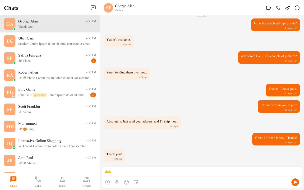
Theming allows you to define the look and feel of your app by adjusting colors, fonts, and other styles. Using CSS variables, you can create a consistent and on-brand chat experience.
Importing the Stylesheet
To enable theming, first, import the base stylesheet containing default styles and variables.
@import url("@cometchat/chat-uikit-react/css-variables.css");
Global Theming with CSS Variables
Customize the entire chat UI by overriding CSS variables in your global stylesheet.
Example: Changing Colors & Fonts
The following CSS variables customize colors, fonts, and other elements.
import { useEffect } from "react";

const App = () => {
  useEffect(() => {
    document.documentElement.style.setProperty(
      "--cometchat-font-family",
      "'Times New Roman'"
    );
  }, []);

  return <div className="cometchat-root">{/* Your chat UI here */}</div>;
};

export default App;
.cometchat {
  --cometchat-primary-color: #f76808;
  --cometchat-neutral-color-300: #fff;
  --cometchat-background-color-03: #feede1;
  --cometchat-extended-primary-color-500: #fbaa75;
  --cometchat-icon-color-highlight: #f76808;
  --cometchat-text-color-highlight: #f76808;
}
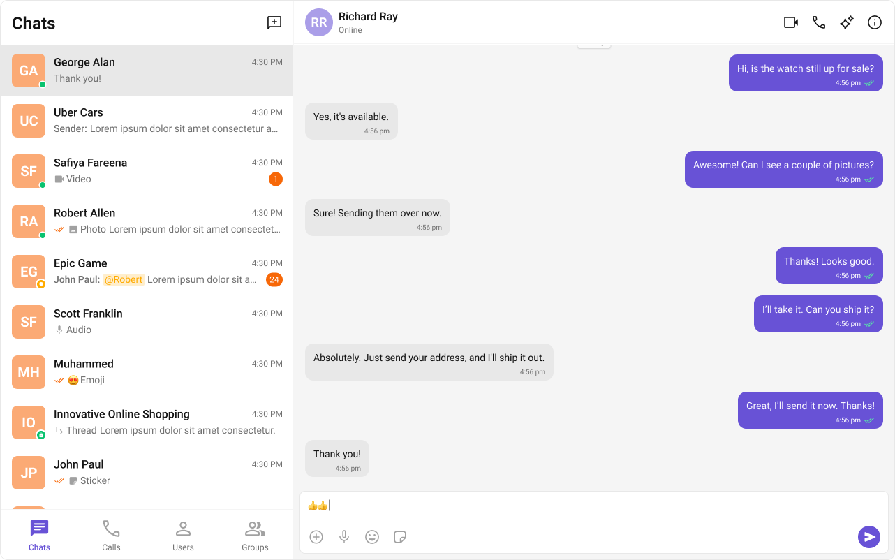
Component-Specific Theming
Want to apply different styles to specific components? Override CSS variables within the component’s class.
.cometchat .cometchat-conversations {
  --cometchat-primary-color: #f76808;
  --cometchat-extended-primary-color-500: #fbaa75;
  --cometchat-text-color-highlight: #ffab00;
  --cometchat-message-seen-color: #f76808;
  --cometchat-radius-max: 12px;
}
Advanced Customization with CSS Overrides
For full control over component styling, use CSS overrides.
.cometchat-conversations .cometchat-avatar,
.cometchat-conversations .cometchat-avatar__image {
  border-radius: 12px;
}
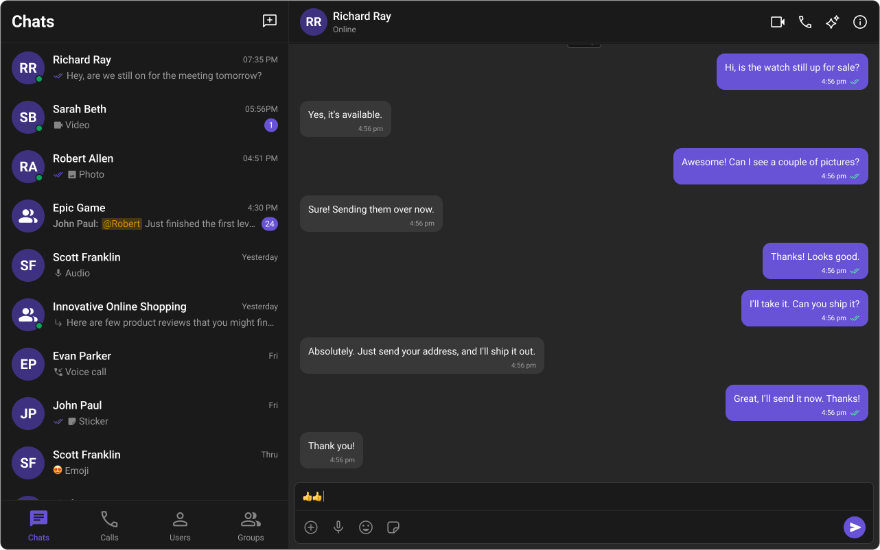
Dark & Light Theme Support
You can switch between light and dark modes.
Example: Enabling Dark Mode
import { useEffect, useState } from "react";

const App = () => {
  const [theme, setTheme] = useState("light");

  useEffect(() => {
    const mediaQuery = window.matchMedia("(prefers-color-scheme: dark)");
    setTheme(mediaQuery.matches ? "dark" : "light");

    const handleThemeChange = (e: MediaQueryListEvent) => {
      setTheme(e.matches ? "dark" : "light");
    };

    mediaQuery.addEventListener("change", handleThemeChange);
    return () => mediaQuery.removeEventListener("change", handleThemeChange);
  }, []);

  return <div className="cometchat-root" data-theme={theme}>{/* Chat UI here */}</div>;
};

export default App;
Customizing Light & Dark Theme
Define different color schemes for light and dark modes.
/* Default (Light) Theme */
.cometchat {
  --cometchat-primary-color: #f76808;
  --cometchat-neutral-color-300: #fff;
  --cometchat-background-color-03: #feede1;
  --cometchat-extended-primary-color-500: #fbaa75;
  --cometchat-icon-color-highlight: #f76808;
  --cometchat-text-color-highlight: #f76808;
}

/* Dark Theme */
@media (prefers-color-scheme: dark) {
  .cometchat {
    --cometchat-primary-color: #f76808;
    --cometchat-neutral-color-300: #311502;
    --cometchat-background-color-03: #451d02;
    --cometchat-extended-primary-color-500: #943e05;
    --cometchat-icon-color-highlight: #f76808;
    --cometchat-text-color-highlight: #f76808;
    --cometchat-message-seen-color: #f76808;
    --cometchat-neutral-color-50: #1a1a1a;
  }
}
📚 Helpful Resources
Enhance your design and development workflow with the following resources:
📦 UI Kit Source Code
Explore the complete list of color variables and hex values on GitHub.View on GitHub 🎨 Figma UI Kit
Access the Figma UI Kit for a fully integrated color palette and seamless customization.View on Figma 