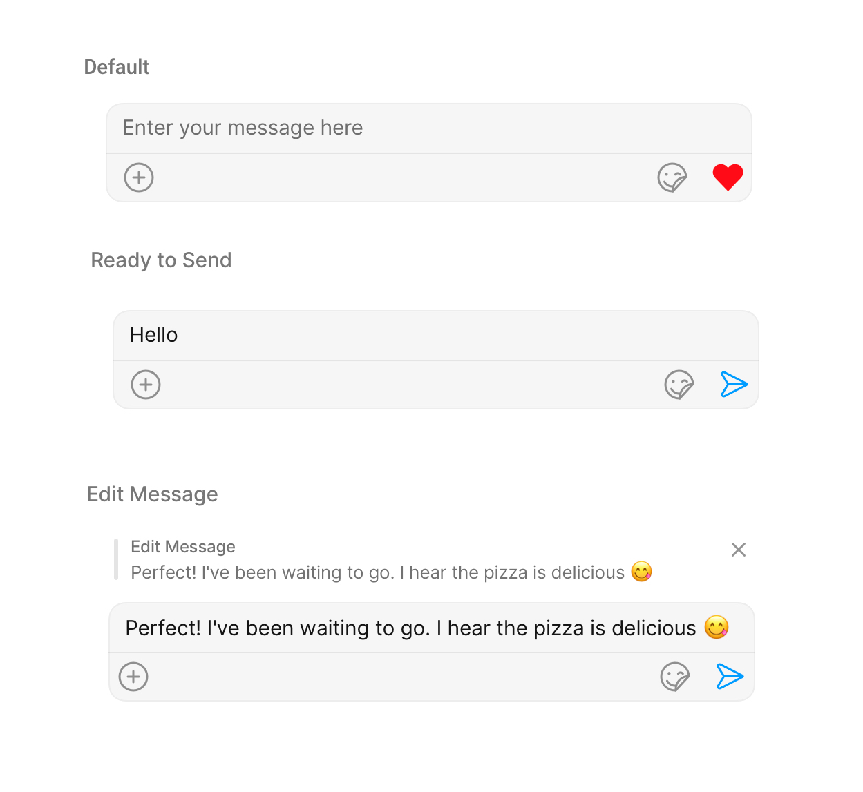
MessageComposer is a Component that enables users to write and send a variety of messages, including text, image, video, and custom messages.Features such as Live Reaction, Attachments, and Message Editing are also supported by it.
iOS
Android
MessageComposer is comprised of the following Base Components:
Base Components
Description
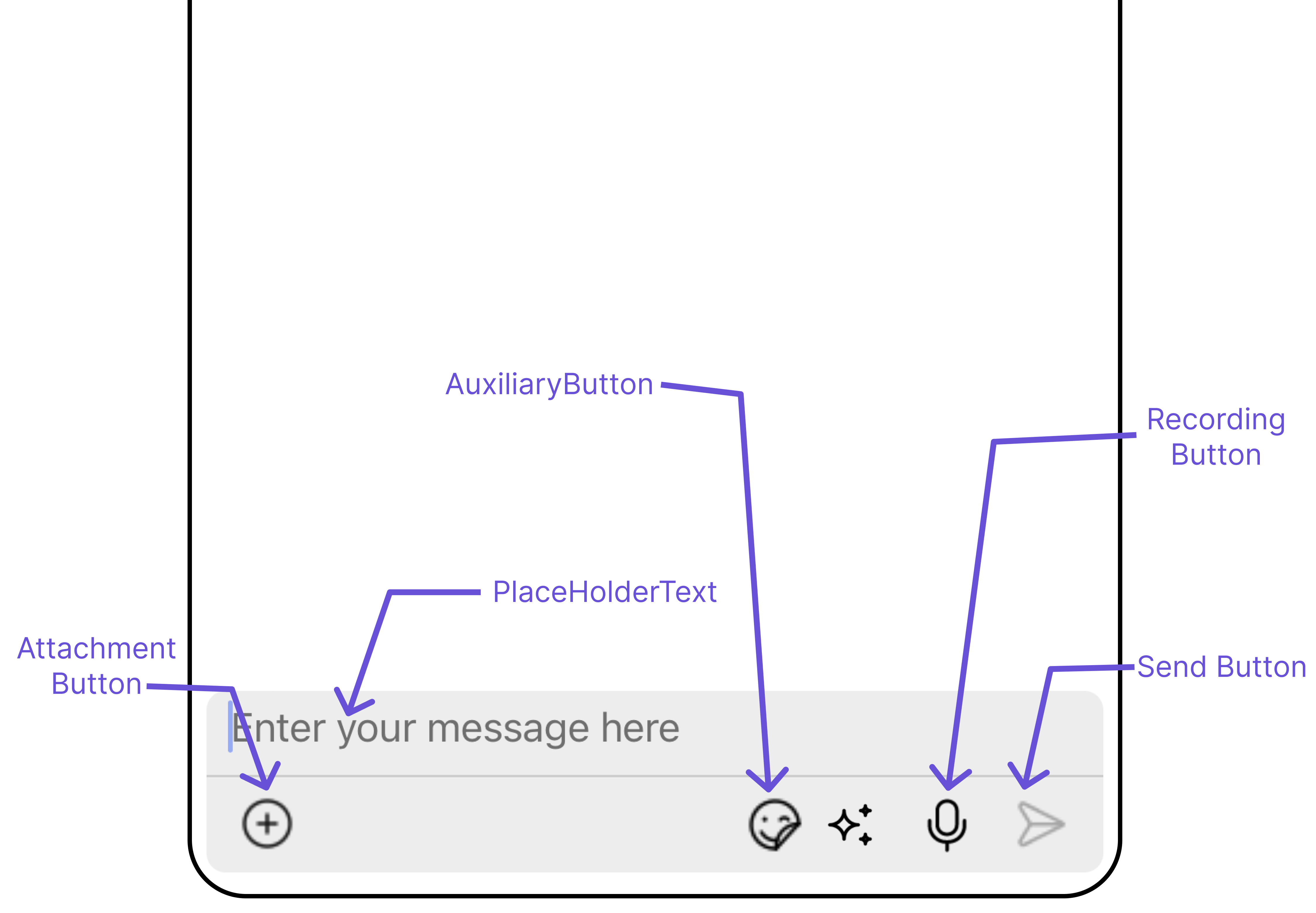
MessageInput
This provides a basic layout for the contents of this component, such as the TextField and buttons
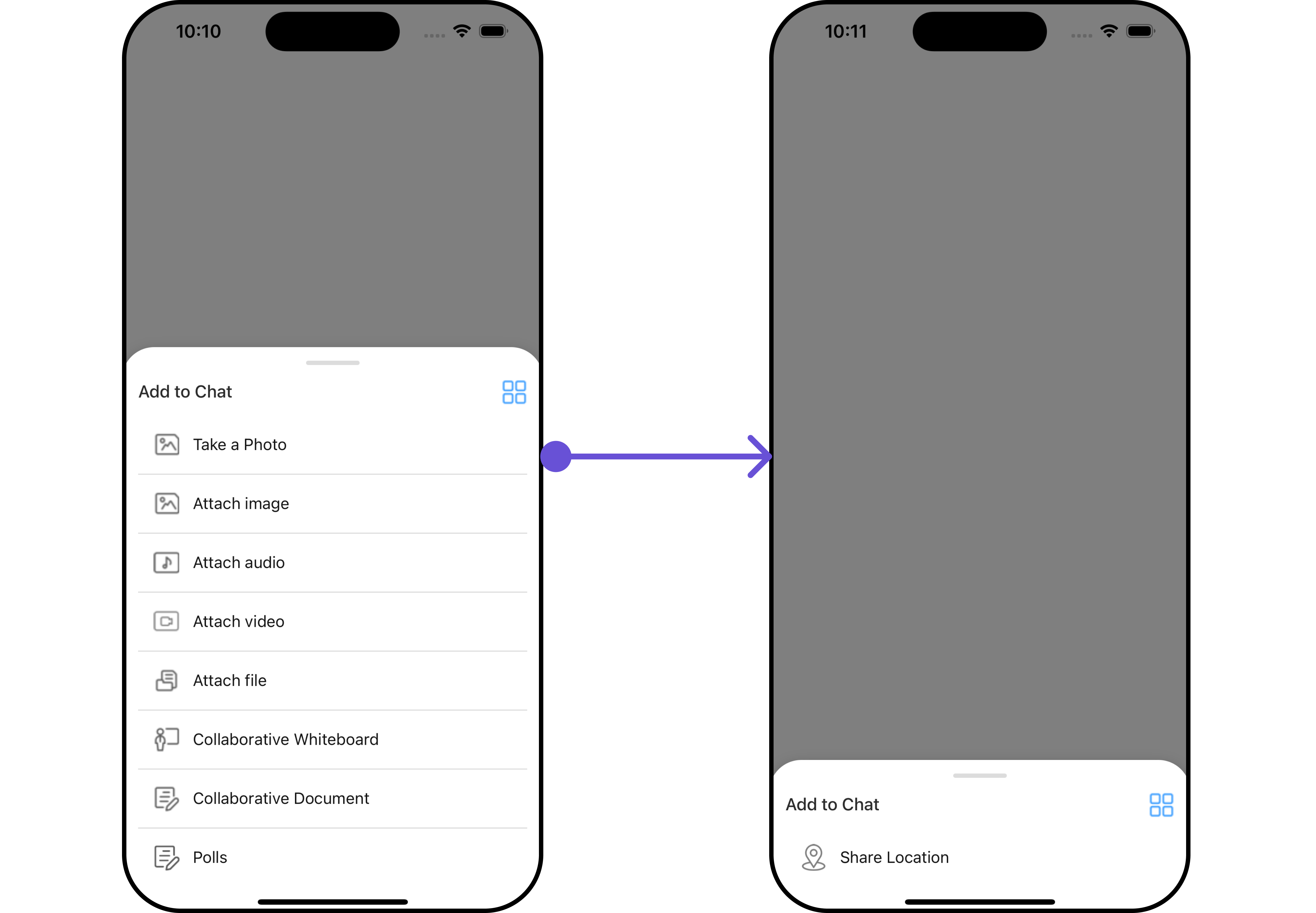
ActionSheet
The ActionSheet component presents a list of options in either a list or grid mode, depending on the user’s preference
Actions dictate how a component functions. They are divided into two types: Predefined and User-defined. You can override either type, allowing you to tailor the behavior of the component to fit your specific needs.
1. onSendButtonPress
The onSendButtonPress event gets activated when the send message button is clicked. It has a predefined function of sending messages entered in the composer EditText. However, you can overide this action with the following code snippet.
Events are emitted by a Component. By using event you can extend existing functionality. Being global events, they can be applied in Multiple Locations and are capable of being Added or Removed.The list of events emitted by the Messages component is as follows.
Event
Description
ccMessageSent
Triggers whenever a loggedIn user sends any message, it will have two states such as: inprogress, success & error
ccMessageEdited
Triggers whenever a loggedIn user edits any message from the list of messages. It will have two states such as: inprogress, success & error
ccMessageLiveReaction
Triggers whenever a loggedIn clicks on live reaction
To fit your app’s design requirements, you can customize the appearance of the MessageComposer component. We provide exposed methods that allow you to modify the experience and behavior according to your specific needs.
Using Style you can customize the look and feel of the component in your app, These parameters typically control elements such as the color, size, shape, and fonts used within the component.
1. MessageComposer Style
To modify the styling, you can apply the MessageComposerStyle to the MessageComposer Component using the messageComposerStyle property.
The following properties are exposed by MessageComposerStyle:
Property
Description
Code
border
Used to set border
border?: BorderStyleInterface,
borderRadius
Used to set border radius
borderRadius?: string;
backgroundColor
Used to set background colour
background?: string;
height
Used to set height
height?: string;
width
Used to set width
width?: string;
inputBackground
Used to set input background color
inputBackground?: string;
inputBorder
used to set input border
inputBorder?: BorderStyleInterface;
textFont
Used to set input text font
textFont?: FontStyleInterface;
textColor
used to set input text color
textColor?: string;
placeHolderTextColor
Used to set placeholder text color
placeHolderTextColor?: string;
placeHolderTextFont
Used to set placeholder text font
placeHolderTextFont?: FontStyleInterface;
attachIconTint
Used to set attachment icon tint
attachIcontint?: string;
sendIconTint
Used to set send button icon tint
sendIconTint?: string;
dividerTint
Used to set separator color
dividerTint?: string;
actionSheetSeparatorTint
Used to set action sheet separator tint
actionSheetTitleColor?: string;
actionSheetTitleColor
Used to set action sheet title color
dividerTint?: string;
actionSheetTitleFont
Used to set action sheet title font
actionSheetTitleFont?: FontStyleInterface;
actionSheetLayoutModeIconTint
Used to set action sheet layout mode icon tint color
actionSheetLayoutModeIconTint?: string;
actionSheetCancelButtonIconTint
Used to set action sheet cancel button icon tint color
actionSheetCancelButtonIconTint?: string;
voiceRecordingIconTint
Used to set voice recording icon color
voiceRecordingIconTint?: string;
2. MediaRecorder Style
To customize the styles of the MediaRecorder component within the MessageComposer Component, use the mediaRecorderStyle property. For more details, please refer to MediaRecorder styles.
These are a set of small functional customizations that allow you to fine-tune the overall experience of the component. With these, you can change text, set custom icons, and toggle the visibility of UI elements.
recordIconUrl={{uri: <image url>}} OR import customReadIcon from "./customReadIcon.svg"; ``recordIconUrl={customReadIconUrl}
pauseIconUrl
Sets custom icon for voice recording pause.
pauseIconUrl={{uri: <image url>}} OR import customPauseIcon from "./customPauseIcon.svg"; ``pauseIconUrl={customPauseIcon}
stopIconUrl
Sets custom icon for voice recording stop.
stopIconUrl={{uri: <image url>}} OR import customStopIcon from "./customStopIcon.svg"; ``stopIconUrl={customStopIcon}
deleteIconUrl
Sets custom icon for voice recording close.
deleteIconUrl={{uri: <image url>}} OR import customDeleteIcon from "./customDeleteIcon.svg"; ``deleteIconUrl={customDeleteIcon}
submitIconUrl
Sets custom icon for voice recording submit
submitIconUrl={{uri: <image url>}} OR import customSubmitIcon from "./customSubmitIcon.svg"; ``submitIconUrl={customSubmitIcon}
auxiliaryButtonsAlignment
controls position of auxiliary button view , can be left or right . default right
auxiliaryButtonsAlignment={"left"}
attachmentIcon
sets the icon to show in the attachment button
attachmentIcon={{uri: <image url>}} OR import customAttchmentIcon from "./customAttchmentIcon.svg"; ``attachmentIcon={customAttchmentIcon}
hideLiveReaction
used to toggle visibility for live reaction component
hideLiveReaction={true}
customSoundForMessage
Used to give custom sounds to outgoing messages
customSoundForMessage="your custom sound for messages"
liveReactionIcon
used to set custom live reaction icon.
liveReactionIcon="your custom live reaction icon"
AIIconURL
used to set custom AI icon.
AIIconURL="your custom AI icon"
hideVoiceRecording
used to hide the voice recording option.
hideVoiceRecording={true}
disableMentions
Sets whether mentions in text should be disabled. Processes the text formatters If there are text formatters available and the disableMentions flag is set to true, it removes any formatters that are instances of CometChatMentionsFormatter.
For advanced-level customization, you can set custom views to the component. This lets you tailor each aspect of the component to fit your exact needs and application aesthetics. You can create and define your views, layouts, and UI elements and then incorporate those into the component.
By using attachmentOptions, you can set a list of custom MessageComposerActions for the MessageComposer Component. This will override the existing list of MessageComposerActions.Example
You can insert a custom view into the MessageComposer component to add additional functionality using the following method.Please note that the MessageComposer Component utilizes the AuxiliaryButton to provide sticker functionality. Overriding the AuxiliaryButton will subsequently replace the sticker functionality.In this example, we’ll be adding a custom SOS button.Example
You can add a custom view into the SecondaryButton component for additional functionality using the below method.In this example, we’ll be adding a custom SOS button.Example
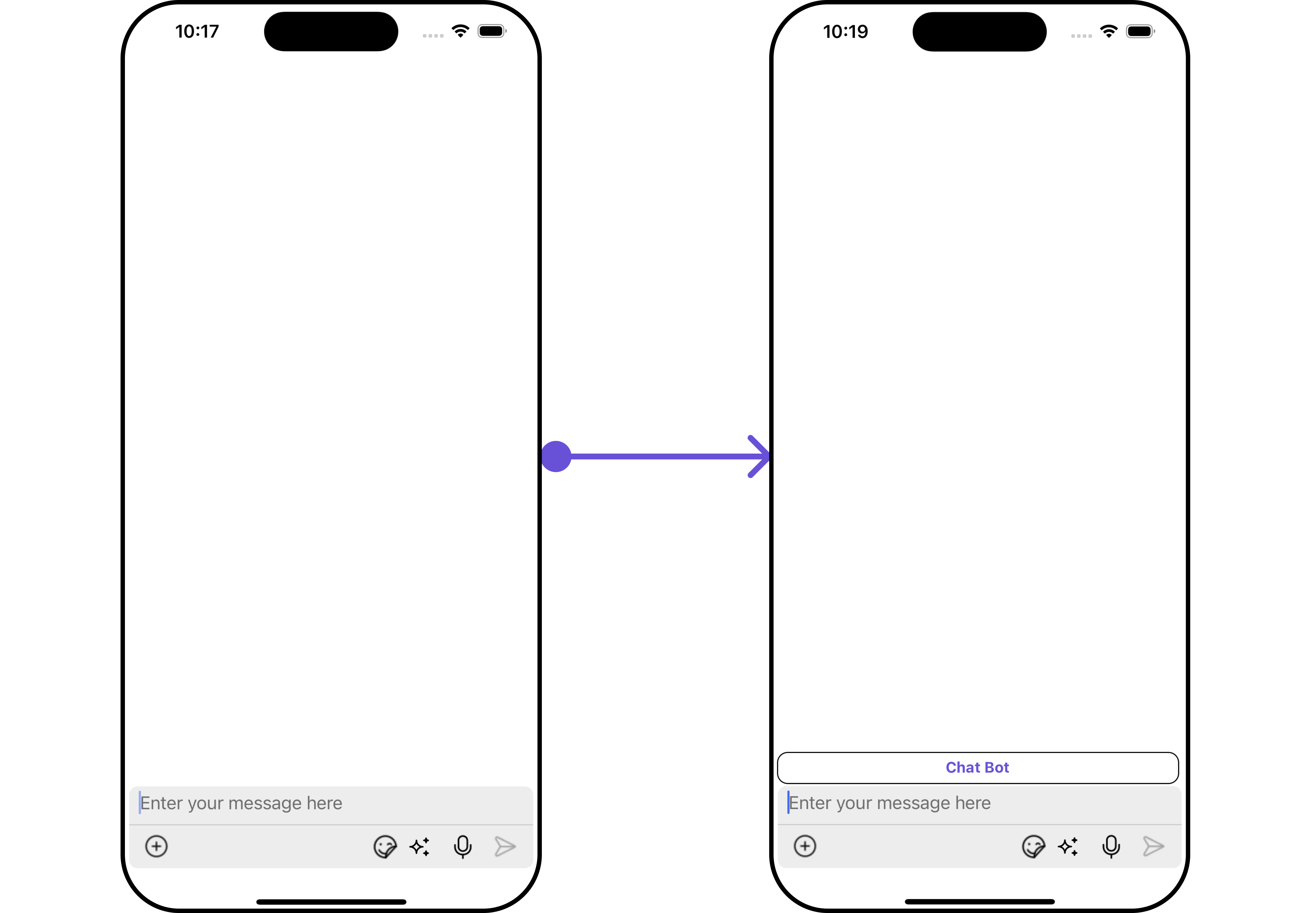
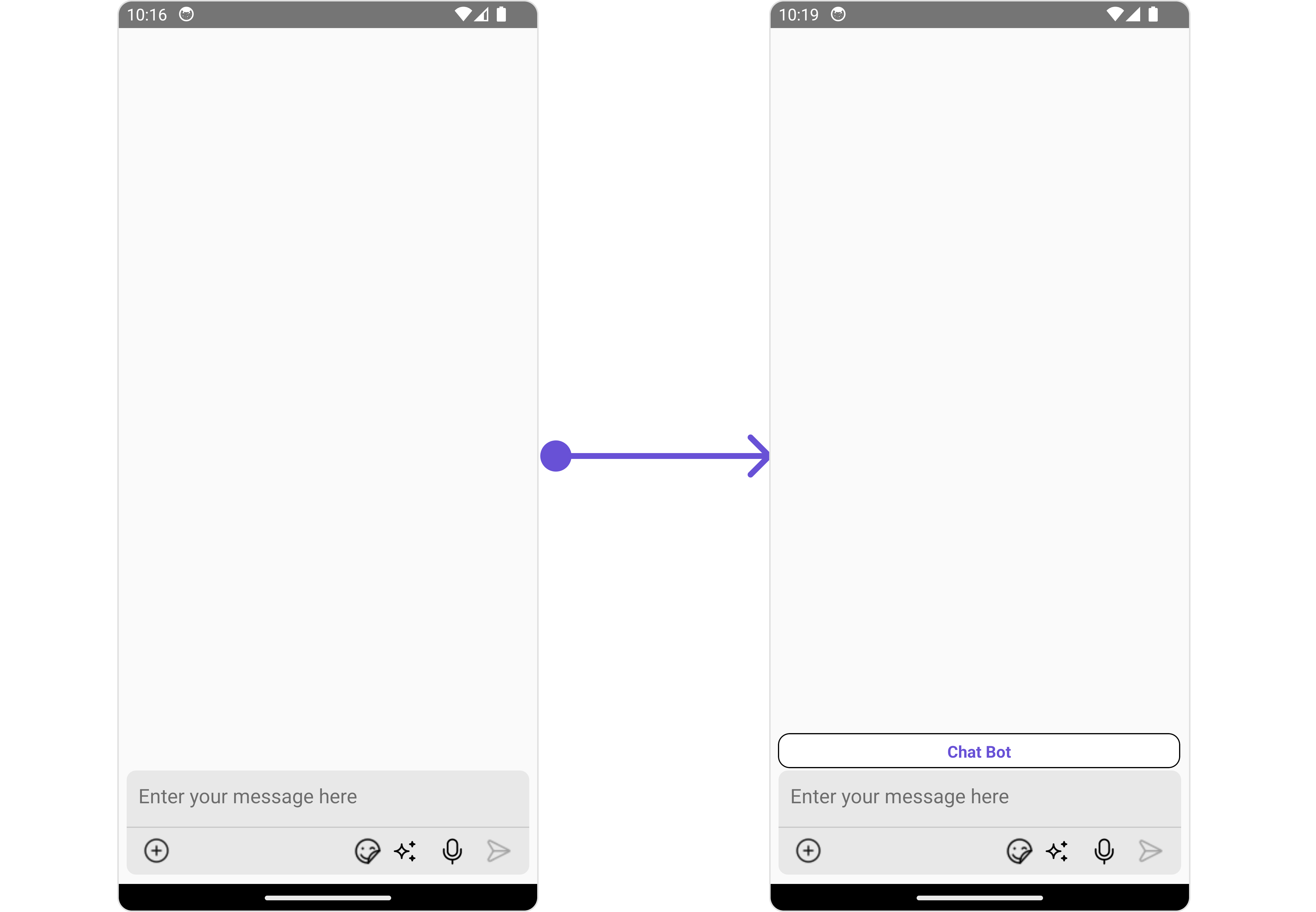
You can set custom HeaderView to the MessageComposer component using the following methodIn the following example, we’re going to apply a mock chat bot button to the MessageComposer Component using the HeaderView property.Example
Assigns the list of text formatters. If the provided list is not null, it sets the list. Otherwise, it assigns the default text formatters retrieved from the data source. To configure the existing Mentions look and feel check out CometChatMentionsFormatter
ShortCutFormatter.ts
App.tsx
import { CometChat } from "@cometchat/chat-sdk-react-native";import { CometChatTextFormatter, SuggestionItem,} from "@cometchat/chat-uikit-react-native";export class ShortCutFormatter extends CometChatTextFormatter { constructor() { super(); this.trackCharacter = "!"; } search = (searchKey: string) => { let data: Array<SuggestionItem> = []; CometChat.callExtension("message-shortcuts", "GET", "v1/fetch", undefined) .then((data: any) => { if (data && data?.shortcuts) { let suggestionData = Object.keys(data.shortcuts).map((key) => { return new SuggestionItem({ id: key, name: data.shortcuts[key], promptText: data.shortcuts[key], trackingCharacter: "!", underlyingText: data.shortcuts[key], }); }); this.setSearchData(suggestionData); // setting data in setSearchData(); } }) .catch((error) => { // Some error occured }); this.setSearchData(data); }; // return null in fetchNext, if there's no pagination. fetchNext = () => { return null; };}